
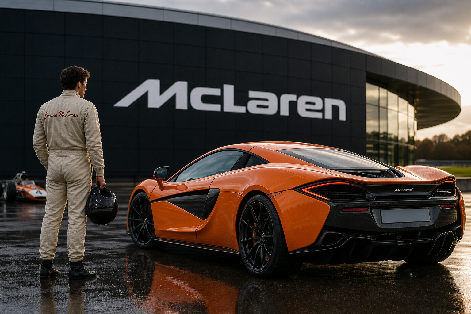

McLaren’s latest logo may look like a fresh piece of corporate housekeeping, but its most interesting detail is that the idea behind it predates McLaren as a formal company. That gives the new wordmark rather more historical weight than the usual exercise in making letters slightly cleaner and calling it a transformation.
The change is being presented as a signpost for McLaren’s next phase of innovation. Yet the real story sits further back, in the period when Bruce McLaren was still building a racing identity around his own name, long before the McLaren brand became shorthand for Formula 1 success, carbon-fiber supercars, and expensive orange objects that appear to have been designed by a wind tunnel.
A Logo With a Head Start
McLaren’s new wordmark is not an entirely new invention. Its design draws on an earlier visual identity associated with Bruce McLaren and the racing organization he established in the 1960s. In other words, the company is not throwing away its history in favor of a fashionable piece of digital branding. It is reaching backward and polishing something that was already there.
That distinction matters. Corporate logos are often treated as disposable graphics: change the typeface, flatten the colors, remove a few details, and announce that the business has entered a bold new chapter. Sometimes the result looks less like a new chapter and more like a software update nobody asked for.
McLaren’s approach is more restrained. The wordmark keeps the brand’s name as the central feature and uses a cleaner, more contemporary treatment without abandoning the visual connection to the marque’s racing origins. It is familiar enough to retain recognition, but deliberate enough to suggest that McLaren wants the identity to work across more than one part of the business.
Why the Early History Matters
McLaren was founded by New Zealand racing driver and engineer Bruce McLaren in 1963. The organization began as a racing operation, not as a luxury road-car business with a motorsport department attached for showroom decoration. Competition was the point from the beginning.
That background still shapes the company’s public identity. McLaren’s name carries associations with Formula 1, Can-Am, sports-car racing, lightweight engineering, and the relentless pursuit of speed. The road cars came later, but the brand’s credibility was forged at circuits rather than in marketing departments.
That is why a logo linked to the period before the formal company existed has genuine relevance. It connects the modern McLaren name to the personal racing identity of Bruce McLaren, rather than treating the founder as a historical footnote. The wordmark becomes a small reminder that the brand began with one driver-engineer’s ambition before it became a global business.
There is also a useful technical parallel here. McLaren has always made much of evolution through engineering: develop, test, refine, and use what works. The new identity follows a similar path. It is not a complete visual reset. It is an adjustment based on an established foundation.
One Name, Several McLarens
The timing is significant because “McLaren” now covers a collection of operations that would have seemed wildly improbable when Bruce McLaren was racing his own cars.
McLaren Racing remains the competition arm, best known for Formula 1 but also involved in other forms of racing. Its history includes championship-winning Formula 1 cars, major success in North American racing, and a reputation for technical ambition that has survived periods of struggle.
McLaren Automotive is the road-car business, responsible for machines such as the 12C, 650S, 720S, Artura, and the Senna. It became a standalone modern sports-car operation decades after the racing team had established the name, bringing McLaren’s lightweight philosophy and carbon-fiber expertise to public roads.
There is also the wider McLaren Group identity, which has to function across racing, road cars, technology, engineering, and commercial partnerships. A visual system that works on a Formula 1 car, a road-going supercar, a factory wall, a racing suit, and a phone screen has rather more work to do than a badge placed on a trunk lid.
That helps explain why a wordmark can matter even when the cars and race cars remain the real stars. The logo has to travel between very different audiences without losing its connection to the same engineering culture.
The Difference Between Heritage and Nostalgia
McLaren’s decision is also a useful example of how heritage can be handled without turning a brand into a museum exhibit. A company founded around racing does not need to paste an old emblem onto everything and insist that the past was better. Nor does it need to erase every trace of its history in pursuit of an aggressively minimalist future.
The strongest automotive identities tend to evolve in layers. Porsche’s crest, Ferrari’s prancing horse, BMW’s roundel, and the various forms of Mercedes’ three-pointed star have changed over time, but their basic visual logic remains recognizable. Customers do not need a history lecture every time they see the badge. They simply need to feel that the badge belongs there.
McLaren’s wordmark operates in that space. It is a modern presentation of an old idea, rather than a nostalgic recreation of a racing logo for its own sake. That is a sensible distinction. Nostalgia is useful when it supports identity; it becomes rather exhausting when it replaces substance.
A Small Change With a Larger Job
The new wordmark does not alter a McLaren’s engine, suspension, aerodynamic package, or carbon-fiber structure. It will not make an Artura quicker out of a corner, and it will not rescue a Formula 1 car from a poor setup. Logos are not magic. They are shorthand.
But shorthand matters when a company is trying to communicate a broad strategy. McLaren wants its next era to be associated with innovation, and the updated identity gives that message a common visual language. The challenge is making sure the engineering earns the branding.
That is where automotive companies often get themselves into trouble. A new typeface can be launched in a week. Developing a genuinely better powertrain, more effective aerodynamic system, or more dependable software takes rather longer and involves substantially more swearing.
McLaren’s advantage is that its history gives the wordmark something credible to stand on. The brand was not invented by a marketing department searching for a sporty-sounding name. It came from a real racing driver, a real team, and decades of competition. The logo’s value depends on that story being reinforced by the products carrying it.
The Badge Is Only the Beginning
Seen in isolation, McLaren’s new logo is a modest change. Its importance lies less in the shape of the lettering than in the history it revives. The wordmark reaches back to a time before McLaren had become a company in the form most people recognize today—before the supercars, before the corporate structure, and before the orange racing cars became global advertising.
That makes the rebrand unusually appropriate for McLaren. The company is looking forward, but it is doing so with a reminder of where the name came from. Not a grand reinvention. Not a triumphal announcement that typography has solved the future. Just a cleaner expression of an identity that began with Bruce McLaren and has been racing ever since.


0 Comments