
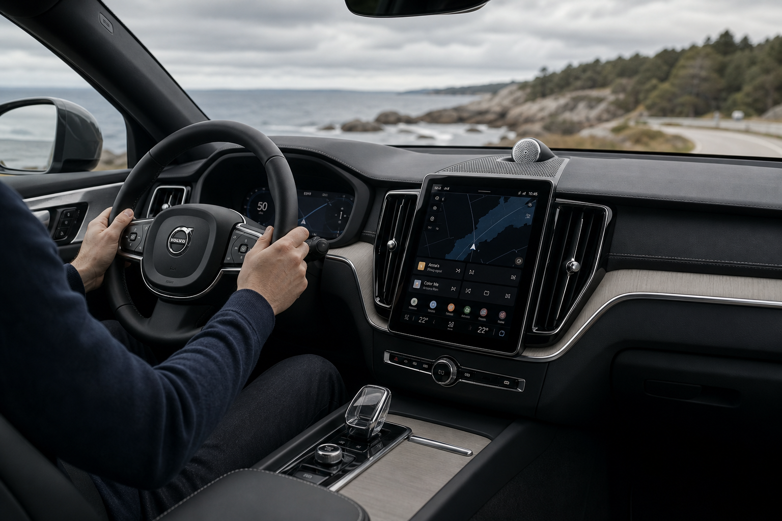

Volvo has finally said the quiet bit out loud: the industry’s love affair with giant touchscreens has gone on too long, and people are rather fed up with it. The Swedish brand’s design boss, Jeremy Offer, has acknowledged that the company leaned too heavily on screen-first interiors and is now planning to bring back more physical controls. Sensible, really. Revolutionary? Hardly. But in a world where even the heater can sometimes feel like it needs a software update before you can warm your hands, it’s welcome news.
The admission matters because Volvo was one of the brands that helped normalise the idea that almost everything could, and perhaps should, be buried in a glossy slab of glass. That worked fine in the showroom, where a minimalist cabin looks elegant and the product planners can boast about “clean design”. In daily life, though, elegance tends to lose a fight with instinct. A button can be found by touch. A menu screen, not so much, unless you’ve got the memory of a church organist and the patience of a saint.
A belated rethink on screen overload
Offer’s comments confirm what plenty of drivers have been muttering for years: screen-heavy interiors may photograph well, but they’re often a nuisance in motion. Volvo is now accepting that the balance tipped too far towards digital interfaces, and that some functions are better handled by proper switches, knobs and buttons. There’s a reason people still like a volume wheel. Nobody has ever sat in traffic and thought, “I really wish this basic task involved fewer tactile clues.”
This is not Volvo abandoning modern technology. Far from it. The company is still committed to large displays, connected features and the usual contemporary conveniences. What is changing is the philosophy around how often a driver should have to poke around in layers of software just to do everyday things. The move back towards physical controls is essentially an admission that usability was sacrificed at the altar of style. Gorgeous altar, admittedly. Still an altar.
Why this matters for Volvo’s cabin design
Volvo has built a strong identity around restrained Scandinavian interiors, and that part of the formula remains intact. Clean lines, calm materials and uncluttered layouts are all part of the appeal. The trouble is that minimalism can become self-parody if it goes far enough. Once the cabin becomes a blank slate with one enormous screen bolted to it, you are no longer being elegant. You are just making the driver do admin.
The return of buttons should help Volvo correct that. Functions that matter most in everyday use — climate control, audio volume, some drive settings, and other frequently adjusted features — are precisely the sort of things that benefit from a dedicated control. The goal isn’t to drag the cabin back to the dark ages, complete with a dashboard festooned like the cockpit of a 1980s airliner. It’s to restore a bit of common sense.
A broader industry lesson, finally learned
Volvo is not alone in discovering that customers do not necessarily adore touchscreen theatre. Plenty of manufacturers have spent the last decade chasing the same clean, tech-laden look, only to find that drivers value convenience more than visual purity once they’ve actually had to use the thing in anger. A cabin that feels pristine when parked can become deeply irritating when you’re trying to demist the windscreen in a drizzle and keep an eye on a roundabout at the same time.
That’s the bit the industry occasionally forgets: cars are not living room televisions, and most drivers do not want to navigate sub-menus while doing 70mph on the motorway. The safest, easiest solutions are often the old ones, which is awkward for people who would rather sell you a software ecosystem than a decent switchgear package.
What to expect next
Volvo’s shift won’t happen overnight, but the direction is clear enough. Future models are likely to move towards a better mix of digital and physical controls, rather than asking drivers to play hunt-the-icon on a glass panel every five minutes. That should make the cabins more usable, less fiddly and — whisper it — more premium in the real world, where premium usually means things work without a tutorial.
It’s also a useful reminder that good design is not always about subtraction. Sometimes adding a few buttons back is the smarter, cleaner solution. The trick, of course, is making them feel deliberate rather than apologetic. Volvo appears to have realised that minimalism is only charming when the driver does not need to perform a small touchscreen treasure hunt to turn the fan down.

0 Comments